Key takeaways
- Show total costs, especially shipping, before the final step so the price never surprises anyone.
- Offer guest checkout and several payment options to remove avoidable friction at the worst moment.
- Send a short abandoned cart email sequence and expect a realistic recovery in the single digits.
The short answer
Stores asking how to reduce cart abandonment usually need to remove surprises and friction at the exact moment a shopper decides to buy. Show shipping costs and the full total early, allow guest checkout, offer several trusted payment options and keep the final steps to a minimum. Support those basics with visible trust badges near the pay button, a fast mobile experience and a short abandoned cart email sequence afterwards. Most shops see 60 to 75 percent of filled carts abandoned, so every point you claw back is genuine revenue; work through the sections below in order and two or three changes nearly always pay for themselves within a couple of months.
Why shoppers abandon their carts
Abandonment is rarely caused by one big problem; it is usually a stack of small ones. Unexpected costs come first: a shopper reaches the last step, sees shipping and taxes added on top and leaves without a word. Forced account creation, long forms, slow loading pages and a limited set of payment options all push people away for similar reasons. None of these feel dramatic in a meeting, yet each one taxes every single order, and each one is fixable.
- Unexpected shipping or tax costs revealed late
- Mandatory account creation before purchase
- Long, cluttered checkout forms
- Slow or glitchy pages on mobile
- Missing payment methods a shopper prefers
- Weak trust signals at the moment of payment
B2B checkouts deserve a special mention. Business buyers often need formal quotes, purchase orders or approval steps, and a purely consumer style checkout loses them completely. Our guide to B2B website design Spain looks at how to turn complex business buying journeys into clear decisions, and the same clarity pays off in any ecommerce checkout, consumer or corporate.
Show shipping costs before checkout
Shipping cost transparency is the single highest value fix on this list. Show estimated shipping on the product page or in the cart, not at the final step. A simple shipping calculator in the cart, a free shipping threshold banner such as free shipping over $50, and clear returns information remove the main surprise that kills orders. If delivery takes longer than a week, say so plainly; shoppers forgive slow delivery far more often than they forgive vague delivery. One practical pattern is a slim banner inside the cart showing how much more the shopper needs to spend for free shipping.
Selling internationally raises the stakes. Duties, currency conversion and local payment habits all differ, and a checkout that suddenly switches language is its own abandonment trigger. If your store runs several languages, our guide to configurar multilenguaje wordpress seo explains how to keep every locale consistent from product page to confirmation email, so shoppers never feel like they have wandered onto a different site at the worst possible moment.
Guest checkout, payment options and exit intent
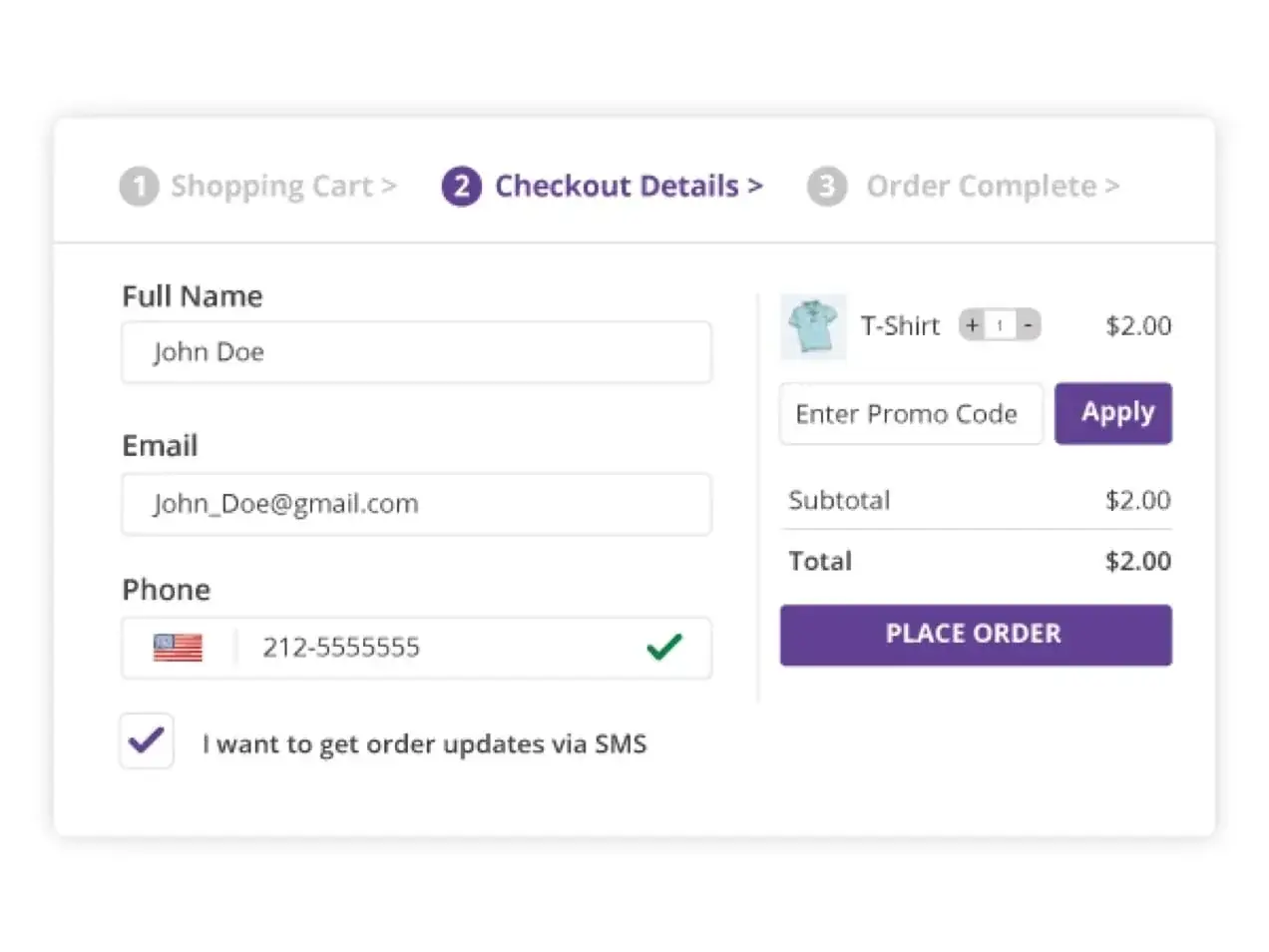
Guest checkout should be the default, with account creation offered after the order as an optional extra. Every extra field costs conversions, so ask only for what you need to take payment and deliver: name, email, address, payment. If you sell to returning customers, recognise them by email address instead of forcing a login wall.
Payment options matter just as much. Cards alone are no longer enough in most markets; wallets such as PayPal, Apple Pay and Google Pay, plus instalment options where they are normal for your price range, let people pay the way they already trust. Every method you add should appear as a recognisable logo early in checkout, not as a surprise in the final step.
Exit intent tools, which show a small message when a cursor moves to leave, can work when they are restrained: a reminder, a shipping reassurance or a saved cart link. Aggressive discount pop ups train shoppers to abandon on purpose, so use them sparingly and never stack them.
Trust badges and speed that reduce cart abandonment
Trust badges earn their place at the payment step: SSL padlock indicators, recognised payment logos, a short returns promise and a real contact route. What matters is specificity. A named delivery window, a phone number or a human reply to a question asked before purchase does more than a wall of generic seals. Place the strongest signals directly beside the pay button, where doubt actually happens.
Speed is a trust signal too. A checkout that stalls on mobile reads as unsafe, and slow pages measurably cut conversions on every step of the funnel. Compress images, trim scripts and test the checkout on a mid range phone over a mobile network, not only on a fast office connection.
If your store runs on WooCommerce and these changes feel beyond your team, an agencia especializada en woocommerce, meaning a specialist WooCommerce agency, can audit the checkout flow properly. Platform specialists know which plugins conflict, which settings quietly block guest checkout and which updates slow the payment step down.
Abandoned cart emails that recover sales
Abandoned cart emails are the cheapest recovery channel you own. A three message sequence covers almost everything: a friendly reminder within an hour, a help focused follow up the next day that answers common objections, and a final message after two or three days that closes with either a modest incentive or a last call. Keep subject lines plain and personal, include the cart contents and a single button, and make the links land directly back in a filled cart, not on the homepage.
Set realistic expectations. A well built sequence typically recovers a single digit percentage of abandoned carts, occasionally reaching the low teens for strong offers. That is still excellent, because the emails cost almost nothing to run, but it is a safety net rather than a business model; the sections above remain the main act. Timing beats discounts too, since most recoveries happen on the first reminder rather than the coupon.
If you run your store on Shopify and want the sequence wired into your wider marketing properly, an agencia experta en shopify españa can set up flows that respect local languages and payment habits while you focus on the catalogue.
Frequently asked questions
What is a typical cart abandonment rate?
Most online stores see between 60 and 75 percent of filled carts abandoned, with mobile traffic usually worse than desktop. The number varies by industry, price range and traffic quality, so treat any single benchmark with caution. What matters more is your own trend: measure it monthly, change one thing at a time and watch whether the rate moves.
Do exit intent pop ups actually work?
They can, when the offer is restrained. A reminder, a shipping reassurance or a link that saves the cart often helps; a loud discount wall usually trains shoppers to abandon on purpose to trigger the code. If you use one, cap the frequency, make it easy to dismiss and never show it to someone who is already typing their payment details.
Should I force shoppers to create an account?
No. Offer guest checkout as the default path and invite account creation after the order is complete, when the shopper has already received value. Forced registration is one of the most commonly cited reasons for abandonment, especially on mobile where typing is slower. If you need accounts for warranties or B2B invoicing, explain the benefit on the form itself rather than behind a login wall.
How many abandoned cart emails should I send?
Three is the practical sweet spot: a reminder within the first hour, a help focused message the next day and a final nudge after two or three days. Beyond that, response rates drop and unsubscribes rise. Include the cart contents, one clear button and a link that restores the basket automatically, and keep the tone helpful rather than pushy throughout the sequence.